For this edition of Project Roundup, we’re featuring our recent work for North Castle Partners, a small cap consumer private equity firm, and Wanderlust 108s, a series of the world’s only mindful triathlon.
North Castle Partners
North Castle Partners is a leading small cap consumer private equity firm focused on the healthy, active, and sustainable living sectors.
When they came to us, North Castle had just completed an in-depth rebranding effort. We worked with their new brand framework to deliver a digital experience that speaks to North Castle’s renowned reputation.
North Castle is a values-driven firm, so we focused on highlighting their story and mission throughout the design. North Castle’s four cornerstones, which are especially important to how the firm operates and works with partners, are prominently on display on the homepage and also has its own dedicated section.

The target audience for this site is entrepreneurs of businesses in the healthy, active, and sustainable space and investors, most of whom would be visiting to research North Castle’s approach and past performances. To reach this audience, we highlighted North Castle’s expansive portfolio and the firm’s accomplishments within each of their investment sectors. Featuring brands from North Castle’s past and present portfolio, we made it easy for users to filter brands by industry sector.


Photo direction played a huge role in designing North Castle’s website. Every photo was carefully chosen to showcase North Castle Partners’ healthy living focus. The footer imagery is especially noteworthy. We created a visual system that allows for a cycle of footer photos, so users see a new and impactful footer on every page refresh.

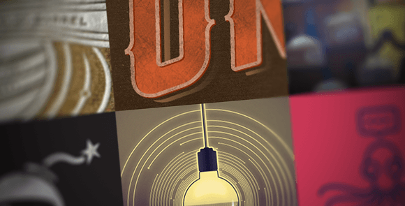
To determine the correct batch of photos to use for North Castle’s footers, we took things offline: We printed every photo option along with every page to ensure that the photos chosen would work throughout the site. This technique allowed us to view many possibilities side by side and quickly rearrange and assemble as necessary.
Quick access of information is also vital for North Castle’s audience. As many entrepreneurs are on-the-go, our design is fully responsive in order to optimize the mobile experience. Users can easily access the information they need on any device or screen size.

Wanderlust 108
Wanderlust Homepage from Barrel on Vimeo.
Wanderlust is a yoga lifestyle brand that has pioneered the infusion of adventure and culture into the health and wellness scene. Wanderlust is best known for their festivals–multi-day events that bring together world-renowned yoga instructors, music performances, lectures, outdoor adventures, organic food, wine, and art.
Recently, Wanderlust has expanded beyond festivals with the launch of their one-day event offering, Wanderlust 108. Wanderlust 108s are mindful triathlons that combine a 5k run, yoga session, and guided meditation, all in your local park. 108 events happen in cities across the country at least once a month.
A unique challenge for this project was working with two sets of branding: one for Wanderlust 108s and the other for Wanderlust Festivals and media. We had to balance the 108 branding with the branding already present throughout the rest of the site.
We struck a balance by redesigning the navigation dropdowns for both Festivals and 108s. By redesigning this feature, we brought something new to the entire site, tying in the new look and feel of the 108 pages. The dropdown has a banner image and text description along with listings for all upcoming events. This way, we surface as much content as possible for users looking to register for an event.

Loading & transitions throughout the site were considered in order to bring the fastest and most seamless loading times possible. The 108s Overview page opens with a full-screen video. This video brings users directly into the 108 experience.
On individual Wanderlust 108 pages, we created a timeline that clearly displays the flow of the day. Users can easily see how the days are structured as well as all of the activities that are available to them.

Need help on a project that requires branding, UX design, or a technology solution? Get in touch, and we’ll let you know if we’re a good fit or point you toward someone that can help.


