At Barrel, we employ a variety of UX techniques at the beginning of a project to make sure the structure and functionality groundwork of the site is solid before we begin visual design. One of the techniques we often rely on is the creation of wireframes.
What is a Wireframe?
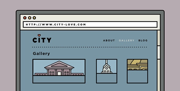
A wireframe is the skeleton of the page, usually drawn with basic shapes and lines with limited colors and styling. The point is to focus on figuring out key aspects like layout and content placement, and solving navigation and functionality problems in a format that is easy to adjust. Wireframes are also useful to present to clients so that both parties can make decisions about these structural issues without getting distracted by visual brand elements and images.
When We Wireframe
Wireframes usually happen after the content strategy groundwork has been done and before beginning visual design. During content strategy, we would usually have a site map worked out to determine the navigational structure of the pages. We also outline the different content types that need to be accounted for on the site, whether through a content audit of the old site or through discussions with the client.
These days, we rarely ever start a design without going through some sort of wireframing process. Even if the client doesn’t need to see a wireframe, we still try to create one internally so that UX designers, visual designers, and developers are all on the same page.
How We Wireframe
There are a wide variety of wireframing tools and apps out there that make wireframing quick and easy. Some apps, such as Balsamiq Mockups, Omnigraffle, and Axure, are widely used by web professionals for creating wireframes and have very extensive tool sets. Software such as Powerpoint and Keynote are also used for wireframing with add-ons like Keynotopia providing ready-made user interface elements. Good old paper and sharpie also make an excellent wireframing tool set.
At Barrel, we do most of our website designs with Adobe Illustrator, and we tend to stick with it for wireframing. It helps that we’re already extremely efficient with Illustrator, so making wireframes with it is a no-brainer for us. But we don’t restrict ourselves to just Illustrator, and will even go nuts with sharpie and paper (or marker and whiteboard).
Low Fidelity vs High Fidelity
Low fidelity wireframes usually focus on blocking out the general sections of the layout. We go with low fidelity when we want to leave things a bit more vague and flexible. Usually, it’s to convey the big-picture differences between pages, showing that one page is a form while another page is text content with a sidebar. Most of the times it doesn’t go beyond a bunch of gray boxes or rough sketches.
Low fidelity wireframes are great when the client already has a general idea of what’s on the page and is able to understand what each of the boxes represent. They are also perfect for supplementing other UX documents like site maps and user flows to help provide a quick visual of the page layout.

High Fidelity wireframes can go as far as using actual content. The layout and placement of everything in the wireframe designs are more considered. At Barrel, we use high fidelity wireframes to explore and answer questions like how long a text block is going to be, how many columns of data there needs to be, how many posts we can expect a user to create, and more.

High fidelity wireframes are not only great for helping the client easily visualize what’s going on, but also helpful for designers. We uncover a lot more issues that need to be considered when we start working with the details, helping to save us from headaches later on in the process.
We uncover a lot more issues that need to be considered when we start working with the details, helping to save us from headaches later on in the process.
One thing we give a lot of attention to is the copy on the page. We firmly believe that copywriting is interface design. Copy, whether it’s the language of the buttons or instructions presented to a first-time user, plays a crucial role in the user experience. Also, clients can often get very focused on the copy, so it makes for easier reviews when you use copy that’ll actually be on the final designs.
Things We Do and Things We Avoid When Wireframing
Do: Know the content and goals
What content needs to be on this page? What is the user trying to achieve (or what does the client/business want the user to achieve)? We take the information that we’ve gathered from stakeholder interviews, content audit, and research, and consider all possible pieces of content carefully. We then lay out the page with the content hierarchy in mind, arranging an order that will influence the user to take certain desired actions that fulfill the project’s goals.
Avoid: Lorem ipsum
You might wonder “What’s wrong with some harmless lorem ipsum? It’s just wireframes after all!” At Barrel, we find that it’s more helpful to stay away from lorem ipsum and instead try to use real content where possible. This might mean asking our clients for actual content from the start or taking the extra step to write out real copy on our own. We’ll even go as far as figuring out how to break out paragraphs and use bullets and subheadings to make the content more digestible. As mentioned earlier, copywriting is interface design, which means the body text in the main column is a key part of the overall design. Also, doing this during the wireframing process sets a good precedent for the visual design phase and also for the client to follow later.
We find that it’s more helpful to stay away from lorem ipsum and instead try to use real content where possible.
Do: Define Hierarchy
We try to stick to a consistent set of contrasting text sizes and weights to convey the hierarchy of text content, from headers to body text. The proportions and visual weight of buttons and other elements should be relative to each other’s level of importance. One of the best parts about wireframes being in grayscale is that we can use that to clarify hierarchy in a more clear-cut way. For example, the main action button may be black but the secondary “cancel” button can be light gray. We can worry later about whether that main button will be blue or green, but it’s important to convey the idea of hierarchy through contrasting shades of gray.

Avoid: Fussing over the details
Should the hero image be 350px or 500px tall? Will it be checkboxes or toggle switches? Serif or sans serif? While we love to zero in on details, we know that certain decisions don’t need to be made during the wireframing process and can wait until the visual design phase. We’re definitely mindful of the sizes of the elements in relation to each other as mentioned above regarding hierarchy, but we don’t have to be exact about everything during wireframes. We focus mainly on content, hierarchy, and interaction.
Do: Work out navigation and functionality
We try to consider all the links and what happens when we click on them. Determine the best way to get from point A to point B. We figure out if there needs to be extra navigational elements to help guide the user. Or we’ll make a decision that we don’t need extra navigational elements on a page.
Wireframes are also a good opportunity to consider any special user interface elements. Could the page potentially have a carousel that accommodates both videos and photos? Will there be an expandable section to reveal more content? When considering functionality, we often confer with different members of our project team, including the developer, to make sure that the interactions we have in mind are something we can build out effectively during the development phase. Sometimes the answer may be an easy yes and other times, there may be some back and forth to come up with simpler and less costly approaches.
Wireframes are also a good opportunity to consider any special user interface elements.
Presenting Wireframes
From time to time, we’ve been reminded that not all clients fully understand the point of wireframes. We make sure to explain to our clients that the goal of wireframes is to focus on content, hierarchy, layout, structure, and interactions. This helps to guide the conversation and feedback in a more productive way.
The folks at Viget have written a great post here on what to look for and what kind of feedback to give when reviewing wireframes.
We find it invaluable to link up the wireframed pages into a clickable presentation, especially for something like a web app where the flow and functionality are key. For this, we love using Invision, a web app that allows you to link screens together via hotspots that you can draw anywhere on the page, turning flat images into clickable prototypes. We’ve been able to save countless hours of emailing long explanations and holding conference calls by making our wireframes interactive.
And After All of That
Wireframes are still sketches and guidelines. We try not to get lured into simply “skinning” the wireframe into a design. The goal of wireframes is to convey a designer’s suggestion for how the layout and functionality of the page should work. It is first and foremost a communication tool rather than a completed piece of design and a valuable document to reference when thinking through the final designs. We’ve found that putting in the thought and time into producing strong wireframes can set you up nicely for the rest of the project.


Pingback: Quotes | Annotary
Pingback: http://gaptekinfo.wordpress.com/2014/05/25/cara-mudah-install-windows-7-lengkap-dengan-gambar/
Pingback: http://www.apksave.net
Pingback: https://www.youtube.com/watch?v=LI5eNmJg3Sw
Pingback: https://play.google.com/store/apps/details?id=com.plutonet.justinbiebergames
Pingback: free webkinz codes
Pingback: instant likes on instagram free
Pingback: free instagram followers app iphone
Pingback: instagram followers
Pingback: pay day loan
Pingback: direct payday loans stores in london ontario lender
Pingback: drugrehabcentershotline.com treatment centers
Pingback: instagram followers fast
Pingback: news lnr
Pingback: news lnr dnr
Pingback: songmerte
Pingback: dedpul 2016
Pingback: Зверополис дублированный скачать торрен
Pingback: 042016
Pingback: 04012016
Pingback: film
Pingback: helou zis me
Pingback: sunnyleonelatest
Pingback: toilehtml
Pingback: tubepatrolporn